Multiple Choice
Identify the
choice that best completes the statement or answers the question.
|
|
|
1.
|
Rob and Rebecca organized a bottle recycling program in their school.
Rob
recorded the number of bottles collected by each boy in his team.
Rebecca recorded the number of
bottles collected by each girl in her team.
Which type of graph would be appropriate to display
the data?
a. | Scatter plot | c. | Double-line graph | b. | Circle graph | d. | Double-bar
graph |
|
|
|
2.
|
This table shows the number of students participating in the school recycling
program over 5 years. Year | 2004 | 2005 | 2006 | 2007 | 2008 | Number of Students | 52 | 73 | 87 | 103 | 121 | | | | | | |
Which type of graph would you use if you want to
look for a trend? a. | Circle graph | b. | Bar graph | c. | Line graph | d. | Pictograph |
|
|
|
Students Who Eat School LunchesThese 4 graphs display the same
data. Graph A Graph B  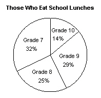 Graph C Graph D 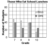 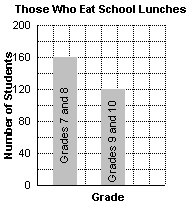
|
|
|
3.
|
Use the 4 School Lunch graphs above.
Which type of graph is most appropriate
for finding the number of Grade 9 students who eat school lunches?
a. | Graph A | b. | Graph B | c. | Graph C | d. | Graph
D |
|
|
|
4.
|
Use the 4 School Lunch graphs above.
Which type of graph is most appropriate
for finding the percent of Grades 8 and 9 students who eat school lunches?
a. | Graph A | b. | Graph B | c. | Graph C | d. | Graph
D |
|
|
|
5.
|
These graphs show the number of males and females who took part in a survey.
Graph A Graph B 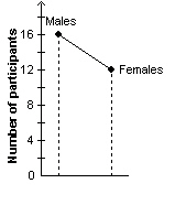 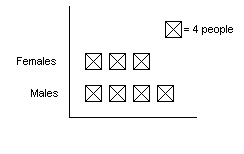 Graph C Graph D 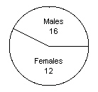
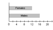 Which graph would be the least suitable way to display the data? a. | Graph A | b. | Graph B | c. | Graph C | d. | Graph
D |
|
|
|
6.
|
This graph shows the number of customers buying from a store in September and
October. 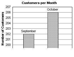 Is the graph misleading? If it is misleading, explain
why. a. | Yes, the bars do not touch. | b. | No, the graph is not
misleading. | c. | Yes, the intervals on the vertical axis between 200 and 207 are not
even. | d. | Yes, the graph exaggerates the difference in the number of customers between
September and October. |
|
|
|
7.
|
These 2 circle graphs show the most popular physical activities that Grade 8 and
Grade 9 students participate in. 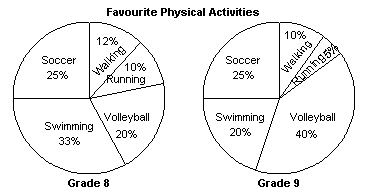 Which statement is true? i) Equal numbers of students in Grade 8 and
Grade 9 play soccer.
ii) More Grade 8 students prefer
swimming.
iii) Running is the least popular activity in both
grades
iv) The number of Grade 8 students who chose volleyball is
the same as the number of Grade 9 students who chose swimming.
|
|
|
8.
|
The graph shows the number of participants in the Fun Run. 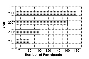 Which
statement is true? i) The number of
participants doubled between 2005 and 2006.
ii) The number of
participants doubled between 2005 and 2007.
iii) There was a 100%
increase in the number of participants from 2005 to 2008.
iv) There
was a 100% increase in the number of participants from 2006 to 2007.
|
|
|
9.
|
Which graph suggests that the number of sit-ups Ray did in November was more
than double the number of sit-ups he did in September?
|
|
|
10.
|
Barone’s Italian Restaurant advertises that its customers are happier than
customers of its competitors. The claim is based on the results of a survey displayed in this
graph. 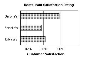 Is the graph misleading? If your answer is yes, explain
why it is misleading. a. | Yes, not enough restaurants were included in the survey. | b. | Yes, the use of
percent exaggerates the difference in the rating. | c. | Yes, Barone’s rating looks better than it
really is because the graph does not start at 0. | d. | No, the graph is not
misleading. |
|
Short Answer
|
|
|
11.
|
The graph shows the winning times of boys and girls for the inter-school 100-m
race for 5 years. 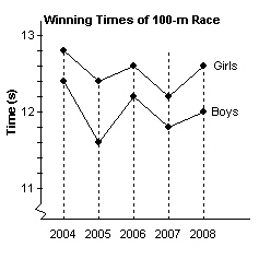 List 3 things you know from the graph.
|
|
|
12.
|
These 2 graphs show the same data: the number of students attending a weekly
math study session. What are the strengths of each graph? Graph
A Graph B 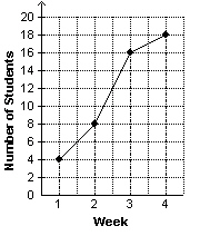 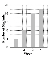
|
|
|
13.
|
These 2 graphs show the same data: the sales of skateboards over a 5-month
period. Graph A Graph B 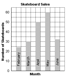 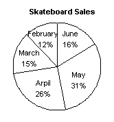 a) List 2 things you know
from the bar graph in Graph A.
b) List 2 things you know from the
circle graph in Graph B.
c) List 1 thing you cannot tell from each
graph.
|
|
|
14.
|
This table shows the weekly sales of T-shirts in a sports store. | Week | 1 | 2 | 3 | 4 | 5 | 6 | | Number of
T-shirts | 18 | 24 | 31 | 38 | 45 | 58 | | | | | | | |
What type of graph would be
most appropriate to display the data? Justify your answer.
|
|
|
15.
|
Three school teams compete in a monthly math competition. This table shows
the scores for each team over 4 months. | | January | February | March | April | School A | 95% | 88% | 92% | 90% | School B | 90% | 93% | 90% | 96% | School C | 85% | 90% |
96% | 92% | | | | | |
Which type of graph would be most appropriate to display the data?
Justify your answer.
|
|
|
16.
|
This table shows the profits for a company over a period of 4 months. Month | 1 | 2 | 3 | 4 | Profit ($) | 6000 | 5000 | 4000 | 3000 | | | | | |
Which graph below would you use if you wanted the fall in profits to
look small? Graph A Graph B 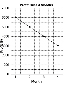 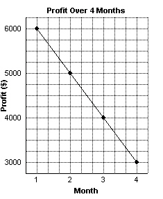
|
|
|
17.
|
These graphs show how 2 students spend their evenings. Can you tell from the
graphs which student spends more time on homework? Explain your answer. 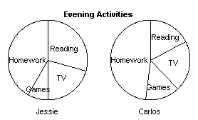
|
|
|
18.
|
This graph shows the number of new clients brought into Sunnydays Insurance
Company. Why is the graph misleading? 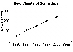
|
|
|
19.
|
This graph shows the number of customers buying from a store in September and
October. How could you change the graph so that the difference in the number of customers between
the 2 months does not seem so great? 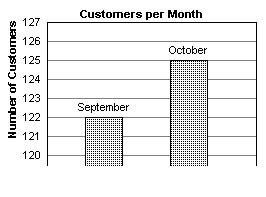
|
|
|
20.
|
This table shows the weekly sales of books over a period of weeks. Display
the data in a graph that suggests book sales have increased dramatically. Week | 1 | 2 | 3 | 4 | Number Sold | 100 | 105 | 115 | 120 | | | | | |
|
Problem
|
|
|
21.
|
This table shows the different types of books borrowed from the school library
over a period of 4 weeks. | | Week
1 | Week
2 | Week
3 | Week
4 | | Fiction | 18 | 18 | 20 | 24 | | Technical | 16 | 14 | 12 | 10 | | Reference | 10 | 12 | 6 | 8 | | | | | |
a) Draw a
line graph to show the number of each type of books borrowed each week.
b) Draw a triple-bar graph to display the
data.
c) Do the graphs show any trends?
|
|
|
22.
|
This table shows the lengths of the 3 sides of a series of triangles. | Triangle | A | B | C | D | | Side
1 | 2 | 3 | 4 | 5 | | Side 2
| 3 | 4 | 5 | 6 | | Side
3 | 4 | 5 | 6 | 7 | | Perimeter | | | | | | | | | |
a) Complete the table for the perimeter of
each triangle.
b) Draw an
appropriate graph to show how the perimeter changes with the length of the shortest
side.
c) What will be the perimeter of a triangle whose shortest
side is 7 units? 12 units?
|
|
|
23.
|
Greg measured the mass of his pet rabbit each month until the pet was 25 months
old. This table shows his data. Age (month) | 5 | 10 | 15 | 20 | 25 | | Mass
(g) | 250 | 300 | 430 | 510 | 540 | | | | | | |
a) Draw an appropriate graph of the data.
Justify your choice of graph.
b)
Estimate the mass of the rabbit at 18 months, and predict its mass at 30 months.
|
|
|
24.
|
These 2 graphs show how 2 students spend their allowance. 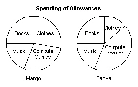 Are these
statements true or false? For statements you consider to be false, add information to make them
true. a) Margo spends as much on
computer games as she does on clothes.
b) Margo and Tanya spend the
same amount on books.
c) Margo and Tanya spend the same amount on
clothes.
|
|
|
25.
|
These 2 graphs show the weekly profit from a snack bar. Graph
A Graph B 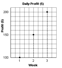 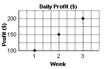 a) Which graph would you
use if you wanted to show the profits were low?
b) Draw a graph that
accurately displays the data.
|