Multiple Choice
Identify the
choice that best completes the statement or answers the question.
|
|
|
1.
|
This table shows the number of students participating in the school recycling
program over 5 years. Year | 2004 | 2005 | 2006 | 2007 | 2008 | Number of Students | 52 | 73 | 87 | 103 | 121 | | | | | | |
Which type of graph would you use if you want to
look for a trend? a. | Circle graph | b. | Bar graph | c. | Line graph | d. | Pictograph |
|
|
|
Students Who Eat School LunchesThese 4 graphs display the same
data. Graph A Graph B 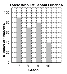 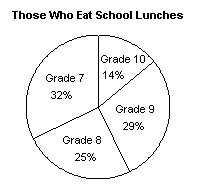 Graph C Graph D 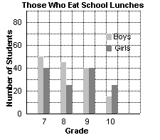 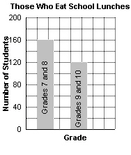
|
|
|
2.
|
Use the 4 School Lunch graphs above.
Which type of graph is most appropriate
for finding the number of Grade 9 students who eat school lunches?
a. | Graph A | b. | Graph B | c. | Graph C | d. | Graph
D |
|
|
|
3.
|
Use the 4 School Lunch graphs above.
Which type of graph is most appropriate
for finding the total number of students who eat school lunches?
a. | Graph A | b. | Graph B | c. | Graph C | d. | Graph
D |
|
|
|
4.
|
These graphs show the number of males and females who took part in a survey.
Graph A Graph B 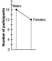 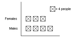 Graph C Graph D 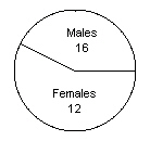
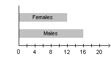 Which graph would be the least suitable way to display the data? a. | Graph A | b. | Graph B | c. | Graph C | d. | Graph
D |
|
|
|
5.
|
Which type of graph is most suitable for showing the depth of water in a pond
over a period of time?
|
|
|
6.
|
These 2 graphs show the number of honour-roll students in each grade at
Bridgeport C. I. | Graph A | Graph B | 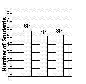 | 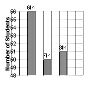 | | |
Which statement is true? a. | The 2 graphs display completely different data. | b. | Graph B shows that
Grade 6 has more than twice as many honour-roll students as Grade 8. | c. | Graph A is a more
accurate representation of the data because the graph starts at 0. | d. | Both statements A
and B |
|
|
|
7.
|
Barone’s Italian Restaurant advertises that its customers are happier than
customers of its competitors. The claim is based on the results of a survey displayed in this
graph. 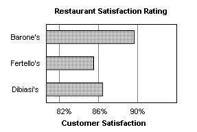 Is the graph misleading? If your answer is yes, explain
why it is misleading. a. | Yes, not enough restaurants were included in the survey. | b. | Yes, the use of
percent exaggerates the difference in the rating. | c. | Yes, Barone’s rating looks better than it
really is because the graph does not start at 0. | d. | No, the graph is not
misleading. |
|
|
|
8.
|
This graph shows the number of customers buying from a store in September and
October. 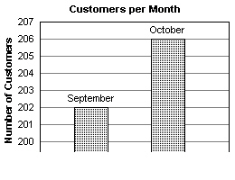 Is the graph misleading? If it is misleading, explain
why. a. | Yes, the bars do not touch. | b. | No, the graph is not
misleading. | c. | Yes, the intervals on the vertical axis between 200 and 207 are not
even. | d. | Yes, the graph exaggerates the difference in the number of customers between
September and October. |
|
|
|
9.
|
These 2 circle graphs show the most popular physical activities that Grade 8 and
Grade 9 students participate in. 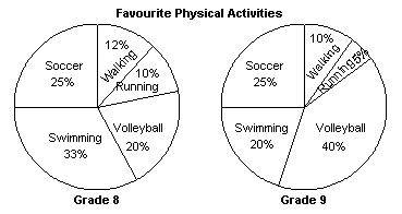 Which statement is true? i) Equal numbers of students in Grade 8 and
Grade 9 play soccer.
ii) More Grade 8 students prefer
swimming.
iii) Running is the least popular activity in both
grades
iv) The number of Grade 8 students who chose volleyball is
the same as the number of Grade 9 students who chose swimming.
|
|
|
10.
|
These graphs show Enid’s scores on 3 tests. In which graph are the data
misrepresented? Graph A Graph B 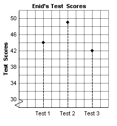
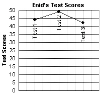 Graph C Graph D 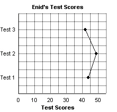
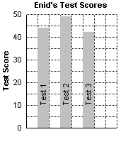 a. | Graph A | b. | Graph B | c. | Graph C | d. | Graph
D |
|
Short Answer
|
|
|
11.
|
The graph shows the winning times of boys and girls for the inter-school 100-m
race for 5 years. 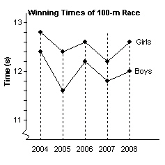 List 3 things you know from the graph.
|
|
|
12.
|
These 2 graphs show the same data: the number of students attending a weekly
math study session. What are the strengths of each graph? Graph
A Graph B 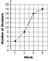 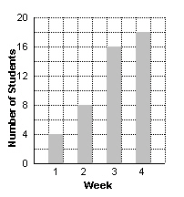
|
|
|
13.
|
A group of students attending outdoor school has been asked to choose an
activity from the list of hiking, kayaking, sailing, and rock climbing.
Which type of graph would
you use to display the data? Justify your answer.
|
|
|
14.
|
Match each description of data to the appropriate type of graph to display the
data. | | Data | | Graph | a) | The
number of candy bars sold in 1 week by grade levels | i) | Line
graph | b) | The ice
cream bars of different flavours sold in 1 week | ii) | Circle
graph | c) | The
weekly sales of juice boxes over a period of 4 weeks | iii) | Pictograph | d) | The
percent of each flavour of potato chips sold in 1 week | iv) | Bar
graph | | | | |
|
|
|
15.
|
Three school teams compete in a monthly math competition. This table shows
the scores for each team over 4 months. | | January | February | March | April | School A | 95% | 88% | 92% | 90% | School B | 90% | 93% | 90% | 96% | School C | 85% | 90% |
96% | 92% | | | | | |
Which type of graph would be most appropriate to display the data?
Justify your answer.
|
|
|
16.
|
These graphs show how 2 students spend their evenings. Can you tell from the
graphs which student spends more time on homework? Explain your answer. 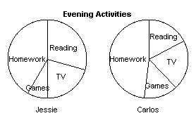
|
|
|
17.
|
This graph shows the number of new clients brought into Sunnydays Insurance
Company. Why is the graph misleading? 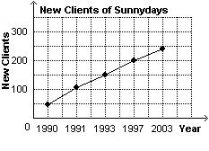
|
|
|
18.
|
Both graphs represent the number of new clients signed up each month at Superior
Realty. Which graph is misleading? Why? Graph A Graph B 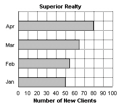 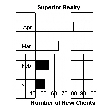
|
|
|
19.
|
This graph shows the expenditures of a company over several years. 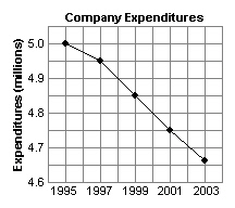 a) Why is this graph
misleading?
b) Explain how the
graph could be changed to present the data more accurately.
|
|
|
20.
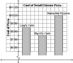
|
This graph shows the costs of a small cheese pizza at 3 different restaurants.
a) Explain how the size of the bars
gives a false impression about the cost of a pizza at different restaurants.
b) Why might Big Al’s Cafe use this
misleading graph?
|
Problem
|
|
|
21.
|
This table shows the number of new cancer cases for males and for females
recorded over 5 years. | Year | 1997 | 1998 | 1999 | 2000 | 2001 | | Males
(´1000) | 65 | 66 | 69 | 71 | 74 | | Females (´1000) | 60 | 62 | 63 | 65 | 66 | | | | | | |
a) Display the data using an appropriate
graph.
b) Describe the trends you see in the
data.
c) Is the increase in new cancer cases greater for males or
for females? Justify your answer.
|
|
|
22.
|
This table shows the average monthly temperatures in Vancouver for 6 months in a
year. | Month | Jan | Feb | Mar | Apr | May | Jun | | Temperature
(°C) | 3 | 5 | 6 | 9 | 12 | 15 | | | | | | | |
a) Display the data using an appropriate
graph.
b) Predict the average temperature in Vancouver for July of
the same year. Justify your answer.
c) Hala predicted the average
temperature in September to be 24°C.
Do you think her prediction is reasonable? Explain.
|
|
|
23.
|
Greg measured the mass of his pet rabbit each month until the pet was 25 months
old. This table shows his data. Age (month) | 5 | 10 | 15 | 20 | 25 | | Mass
(g) | 250 | 300 | 430 | 510 | 540 | | | | | | |
a) Draw an appropriate graph of the data.
Justify your choice of graph.
b)
Estimate the mass of the rabbit at 18 months, and predict its mass at 30 months.
|
|
|
24.
|
Draw 2 different graphs to display the exam grades of 3 students shown in the
table. One presents the data accurately, while the other gives a false impression that
Bill’s exam grade is more than twice Joan’s. Student | Exam
Grade | Joan | 65% | Jill | 92% | Bill | 85% | | |
|
|
|
25.
|
These 2 graphs show Marsha’s monthly telephone bill. Do the graphs
misrepresent the data? If so, what changes can you make to more accurately display the
data? Graph A Graph B 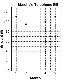 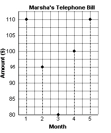
|