Multiple Choice
Identify the
choice that best completes the statement or answers the question.
|
|
|
|
|
|
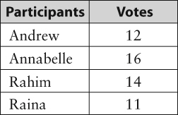
1.
|
Bar graphs are best for
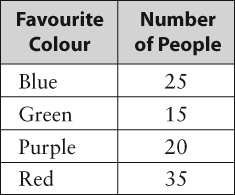
a. | comparing data across categories | b. | comparing data using
percents | c. | comparing data to show changes over time | d. | comparing data that
are easily represented using symbols |
|
|
|
|
|
|
2.
|
On which two tests did the class score at the same level?
a. | Fraction Test and Geometry Test | c. | Geometry Test and Graphing
Test | b. | Fraction Test and Probability Test | d. | Percent Test and Probability
Test |
|
|
|
|
|
|
3.
|
Which graph would you use if you wanted to determine only Keely’s progress
over time?
a. | bar graph | b. | circle graph | c. | double bar
graph | d. | line graph |
|
|
|
4.
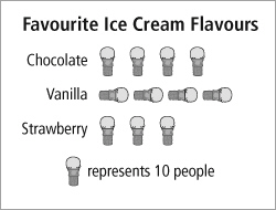
|
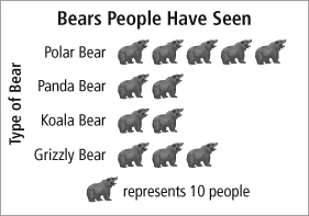
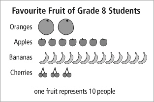
These data could be displayed using a pictograph because
 a. | they are comparing data across categories | b. | they add up to
100% | c. | they can be represented with symbols and can be easily counted | d. | they show changes
over time |
|
|
|
|
|
|
5.
|
One disadvantage of using a pictograph for recording results such as these
is
a. | it is difficult to compare all four players | b. | it is difficult to
know which baskets represent which player | c. | it is difficult to represent accurate numbers
with a fraction of a symbol | d. | it is difficult to see who has sunk the most
baskets |
|
|
|
|
|
|
6.
|
Which graph best shows the fraction of the garden used for each
vegetable?
a. | the bar graph, because it clearly shows numbers along the
y-axis | b. | the bar graph, because it displays the vegetables so clearly | c. | the circle graph,
because it shows percents | d. | the circle graph, because the sum of all the
data is 100% |
|
|
|
|
|
|
7.
|
Which of the two graphs would you use if you wanted to know the total number of
plants in the garden?
a. | the circle graph, because it is easy to add the percents | b. | the circle graph,
because it tells you there are 100 plants | c. | the pictograph, because the symbols are easy to
count | d. | the pictograph, because you can see how many carrot plants are in each
picture |
|
|
|
|
|
|
8.
|
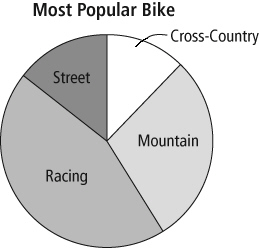
The best graph for showing the fraction of horror movies people chose would be
a
a. | circle graph, to show the percent of horror movies out of all the
choices | b. | double bar graph, to compare two sets of data across categories | c. | line graph, to show
changes over time | d. | pictograph that shows different movie posters
for each type |
|
|
|
9.
|
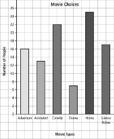
What makes this graph useful when determining how many people chose a movie
type?
a. | all the bars are shaded in different patterns | b. | it labels the
numbers along the vertical axis | c. | it lists the movie types in alphabetical
order | d. | it is made on a computer |
|
|
|
10.
|
Which graph would be best for showing what percent of the time each type of
movie was chosen?
a. | bar graph | b. | circle graph | c. | double bar
graph | d. | line graph |
|
Completion
Complete each
statement.
|
|
|
11.
|
The graph that best shows improvements made by two
students on their math tests is a _________________________.
|
|
|
12.
|
A _________________________ is best for comparing categories to the whole using
percents.
|
|
|
|
|
|
13.
|
The figure shown above is a _________________________.
|
|
|
|
|
|
14.
|
Distorting the scale is a _________________________ feature.
|
|
|
|
|
|
15.
|
This graph is misleading because _________________________.
|
Matching
|
|
|
Choose the term that best matches each example. Terms may be used more than
once or not at all.
a. | axis | b. | bar graph | c. | distort the
scale | d. | distort the size of bars | e. | distort the visuals | f. | frequency
table | g. | line graph | h. | pictograph |
|
|
|
16.
|
|
|
|
17.
|

|
|
|
18.
|
|
|
|
19.
|
|
|
|
20.
|
|
Short Answer
|
|
|
Write your answer in the space provided.
|
|
|
21.
|
Explain how this graph could be misleading.
|
|
|
Julie took a survey to see which topping was the most popular for
pizza. 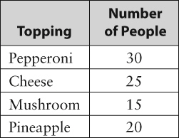
|
|
|
22.
|
Determine which graph would not be useful for Julie. Justify your
choice.
|
|
|
23.
|
What might cause the following graph to be misinterpreted? 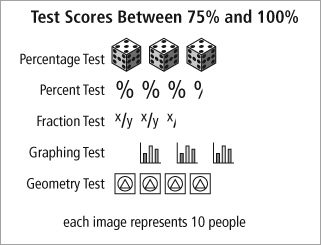
|
|
|
24.
|
Explain how this graph could be revised to make it more informative.
|
|
|
25.
|
Tim is listening to the radio and keeps hearing the same hit song repeated. He
decides to track how many times he hears the song each day over the period of one week. He wants to
show his data to a friend. Which type of graph would you suggest Tim use, and why?
|
Problem
|
|
|
26.
|
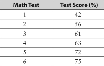
Cassandra’s test results for her first six tests are shown below. Create
the most appropriate graph to show how Cassandra improved her Math scores over the term. Explain your
choice.
|
|
|
27.
|
a) Based on the tallies shown on the frequency table, draw the most
appropriate graph and explain why you chose that type of graph. b) What other types of
graphs might be possible? For what purpose? What disadvantage would each have? 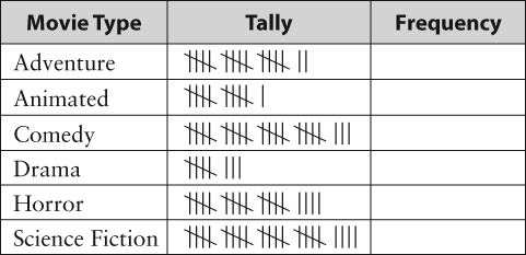
|
|
|
28.
|
Heather recorded the flavours of the ice cream containers sold last month at the
ice cream shop where she works. She displayed her data in a bar graph. 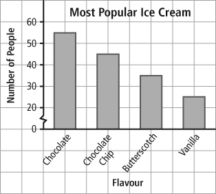
a) Using this graph, why might
Heather claim that chocolate ice cream is three times as popular as vanilla? b) Draw a
circle graph to display the data. Give an advantage and disadvantage of using a circle graph.
|
|
|
29.
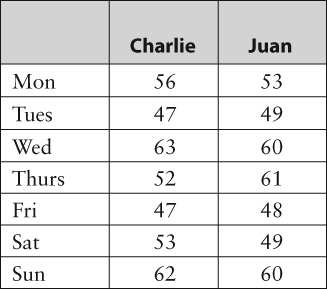
|
a) Juan and Charlie are vying to see who will have the key position in
the upcoming relay race. They record their race times in seconds every day for a week. Draw a graph
to show who improved the most over the week. Using this graph, explain who should have the key
position on the relay team. Explain your choice of graph and person. b) What alternative
argument could you make for your choice of person?
|
|
|
30.
|
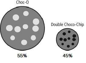
The local grocery store had a competition between two brands of cookies: Choc-O
and Double Choco-Chip. The recorded results are below. a) How is this graph misleading?
b) Draw a new graph to represent the data more accurately. Justify your choice.
|